How do we measure the wealth of nations, to use the title of classical economist Adam Smith’s famous book?
Using Gross Domestic Product (GDP) to measure the annual value of production for each national economy has been under criticism since it was first invented by Simon Kuznets for a report to US Congress in the depth of the Great Depression in 1934. It was the benign view of Kuznets that when capitalist economies ‘take off’ and industrialise, inequality of incomes will rise, but eventually, as economies ‘mature’, income inequality declines. So GDP as an overall measure of the ‘wealth of nations’ was adequate.
But actually annual production is not a measure of wealth (the stock of assets and accumulated efforts of human labour), but a measure of annual productive power. And it crucially excludes the inequalities in the distribution of that power.
So just a few years ago, the UN came up with a more comprehensive measure of ‘human development’. The human development index (HDI) purports to measure the overall well-being of each national population by including health, life expectancy, education and communications in its index.
What the index reveals is that there were substantial gains in world human development from the mid-19th century as the world economy industrialised and urbanised, but especially over the period 1913-1970. The major advance in human development across the board took place between 1920 and 1950, which resulted from substantial gains in longevity and education.
According to the index, although the gap between the advanced capitalist economies and the ‘Third World’ widened in absolute terms; in relative terms, there was a narrowing. The Russian revolution from the 1920s and the Chinese one after 1947 led to fast industrialisation and a sharp improvement in health and education for hundreds of millions. The second world war killed and displaced millions, but it also laid the basis for state intervention and the welfare state that had to be accepted by capital after the war, during the so-called ‘Golden Age’.
But after 1970, the gap in human development widened once again with globalisation, rising inequalities and the capitalist neo-liberal counter-revolution. Only China closed the gap. Since 1970, longevity gains have slowed down in most emerging economies, except China, and all the world regions have fallen behind in terms of the longevity index.
Now the World Bank has entered the fray with its own measure of ‘wealth’ per person. The World Bank economists have measured not GDP levels but wealth i.e. assets such as infrastructure, forests, minerals, and human capital that produce GDP. The World Bank’s Changing Wealth of Nations 2018: Building a Sustainable Future covers national wealth for 141 countries over 20 years (1995–2014) as the sum of produced capital, 19 types of natural capital, net foreign assets, and human capital overall as well as by gender and type of employment.
The results show that that some countries with GDP growth actually saw per capita wealth fall. Asia had a big increase in per capita wealth in the 20 years, driven mainly by China’s phenomenal rise, but sub-Saharan Africa slipped back, largely as a result of continued high birth rates in many countries that offset a rise in nominal wealth. Indeed, the poorest African countries are “shearing away” from the rest of the world.
When countries use their natural resources well, investing primarily in their people to increase labour productivity, then countries leap forward in terms of wealth per capita. As nations develop, they convert natural capital into other forms — roads, factories, hospitals, schools and universities — so the share of natural capital in their total wealth falls, as other forms rise in importance. In high-income OECD countries, natural capital makes up just 3 per cent of total wealth as human and produced capital become the main drivers of growth. In poor countries, natural capital contributes 47 per cent of total wealth, according to the report.
But the UN’s HDI and the World Bank’s wealth per capita measures still do not account for inequalities of distribution, both between national economies globally and within each national economy, between rich and poor. The annual Credit Suisse wealth report does a great job in showing the huge inequalities globally between the richest 1% of wealth holders who currently own more than 50% of the world’s wealth and the bottom 90% who own no more than 14%.
Remember this is wealth across the whole world and so reflects not just inequality of wealth within a country but also inequality between countries. Indeed, most of the top 10% live in the top seven (G7) advanced capitalist economies.
Global inequality has been definitively studied by Branco Milanovic, formerly of the World Bank. I have referred to his work before in numerous posts. Milanovic regularly refines and updates his research on global inequality. Recently he presented a comprehensive summary of his results in a lecture to the Annual Research Conference Brussels, in honour of the Anthony Atkinson, recently deceased and a pioneer in inequality studies.
Using the traditional measure of inequality, the gini index, Milanovic found that global income inequality has risen inexorably from the early days of modern industrial capitalism, interrupted only by the impact of the two terrible world wars of the 20th century. But since 2000, the gini index had fallen back a little, entirely due to the rise in living standards of the mass of the Chinese population.
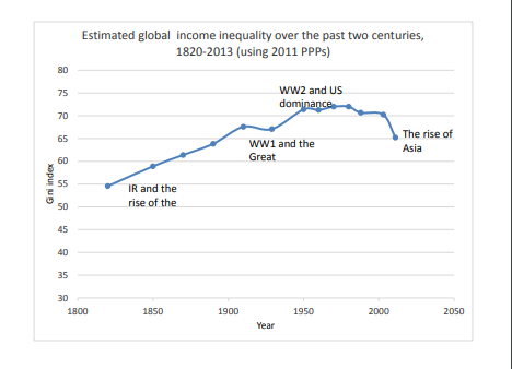
Milanovic notes that global inequality is much greater than inequality within any individual country. The global gini is around 70, substantially greater than inequality in Brazil, the highest for a country. And it is almost twice as great as inequality in the US.
Milankovic finds that the 60m or so people who constitute the world’s top 1% of income ‘earners’ have seen their incomes rise by 60% since 1988. About half of these are the richest 12% of Americans. The rest of the top 1% is made up by the top 3-6% of Britons, Japanese, French and German, and the top 1% of several other countries, including Russia, Brazil and South Africa. These people include the world capitalist class – the owners and controllers of the capitalist system and the strategists and policy makers of imperialism.
But Milanovic finds that those who have gained income even more in the last 20 years are the ones in the ‘global middle’. These people are not capitalists. These are mainly people in India and China, formerly peasants or rural workers have migrated to the cities to work in the sweat shops and factories of globalisation: their real incomes have jumped from a very low base, even if their conditions and rights have not.
The biggest losers are the very poorest (mainly in African rural farmers) who have gained nothing in 20 years. The other losers appear to be some of the ‘better off’ globally. But this is in a global context, remember. These ‘better off’ are in fact mainly working class people in the former ‘Communist’ countries of Eastern Europe whose living standards were slashed with the return of capitalism in the 1990s and the broad working class in the advanced capitalist economies whose real wages have stagnated in the past 20 years.

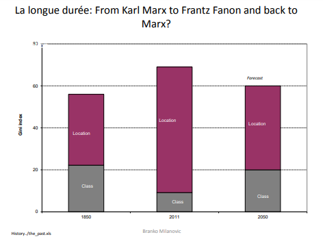
Milanovic reckons that global inequality can be decomposed into two parts. The first part is due to differences in incomes within nations, which means that that part of total inequality is due to income differences between rich and poor Americans, rich and poor Chinese, rich and poor Egyptians and so on for all countries in the world. If one adds up all of these within-national inequalities, you get the aggregate contribution to global inequality. Milanovic calls this the traditional Marxist “class” component of global inequality because it accounts for (the sum) of income inequalities between different “income classes” within countries.
The second component, which he calls the “location” component, refers to the differences between mean incomes of all the countries in the world. Around 1850, ‘class’ explained nearly half of global inequality. But around 2011, around 80% was due to where you lived, ‘location’.
When Milanovic first developed this distinction, he concluded that the Marxist class analysis has been proved wrong. “Karl Marx could indeed eloquently write in 1867 in “Das Kapital”, or earlier in “The Communist Manifesto” about proletarians in different parts of the world—peasants in India, workers in England, France or Germany— sharing the same political interests. They were invariably poor and, what is important, they were all about equally poor, eking out a barely above-subsistence existence, regardless of the country in which they lived. There was not much of a difference in their material positions.” But not now.
However, his latest data suggest that inequalities within nations have increased so much that, given current trends, by 2050 such inequalities will play just as important role as they did 200 years ago when modern capitalism first rose to dominance as a mode of production.
Indeed, the only reason that ‘location’ has been so important for global inequality is the huge difference in living standards for the working populations of the leading imperialist powers and those living in the ‘global south’. That gap has been closed partially by the rise of China (and east Asia and India to a lesser extent), although, as the World Bank data show, not anywhere else. But inequality within China and India has also risen sharply. That adds back to the global inequality index.
In his lecture Milanovic dealt with a technical issue in measuring inequality in the US that has arisen. The work of Piketty, Saez and Zucman in recent years has shown that the share of national income going to the top 1% of income earners had increased substantially since 1960. However, this has recently been disputed by two economists at the US Treasury who argue that the Piketty et al tax return based measures are biased by tax base changes and missing income sources. Accounting for these limitations reduces the increase in top 1% share by two-thirds. Further, accounting for government transfers reduces the increase by over 80%.
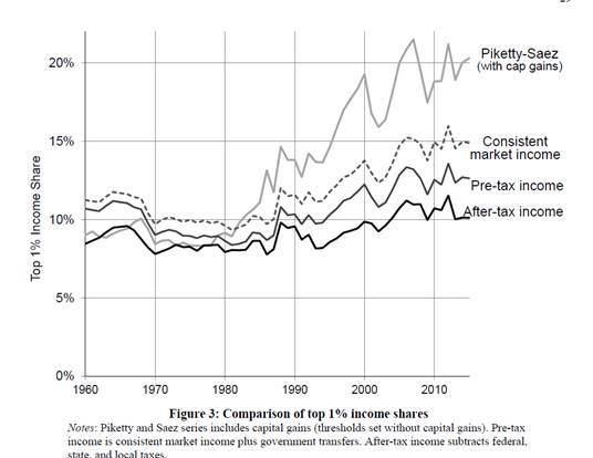
So instead of the top 1% taking 20% of national income currently up from around 10% in 1960, the rise is only from 8% to 10% – not much at all. Well maybe, says Milanovic, but the distortion or gap in the data (strongly denied by Piketty et al by the way) does not seem to apply to any other country, for example, Norway.

As the recently deceased Atkinson had shown, rising inequality of income (and wealth) has been a feature of all major capitalist economies in the neo-liberal period since the 1970s.
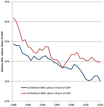
What all this empirical work offers up some important political implications. The UK’s Resolution Foundation found that, while real incomes have risen for lower middle and working classes in the advanced capitalist countries since the 1980s, the bottom 80% labour share of GDP in the UK and US has declined as a proportion of GDP (defined as the labour share of GDP multiplied by the proportion of labour income received by the bottom 80% of the income distribution.
And, as I have pointed out before in previous posts, the management consultants, McKinsey found that in 2014, between 65 and 70 percent of households in 25 advanced economies were in income segments whose real market incomes were flat or below where they had been in 2005 (Poorer Than Their parents? Flat or Falling Incomes in Advanced Economies. This does not mean that individual households’ wages necessarily went down but that households earned the same as or less than similar households had earned in 2005 on average.
US households in the 10th percentile(those poorer than 90 percent of the population) are still poorer than they were in 1989. Across the entire bottom 60 percent of the distribution, households are taking home a smaller slice of the pie than they did in the 1960s and 1970s.
So let’s sum up; what does all the analysis of global and national inequality tell us?
First, that global inequality has increased since capitalism really got going from the 1850s. Second, that the partial fall in global inequality is down to the growth of average income in China, and to a lesser extent and more recently, India. Otherwise, global inequality would have continued to rise. Third, there has been a rise in average household incomes in the major advanced capitalist economies since the 1980s, but the growth has been much less than in China or India (starting from way further down the income levels) and much less than the top 1-5% have gained. So inequality within most national economies has risen, particularly from the 1980s. Fourth, since the beginning of the millennium, most households in the top capitalist economies have seen their incomes from work or interest on savings stagnate.
These outcomes are down partly to globalisation by multinational capital, taking factories and jobs into what used to be called the Third World; and partly due to neo-liberal policies in the advanced economies (i.e. reducing trade union power and labour rights; casualization of labour and holding down wages; privatisation and a reduction in public services, pensions and social benefits). And it is also down to regular and recurrent collapses or slumps in capitalist production, which lead to a loss of household incomes for the majority that can never be restored completely in any ‘recovery’, particularly since 2009.
Milanovic reckons that the majority of the world’s population are ‘trapped’ in low-income countries while real income growth for those in the OECD has slowed. At the same time, the top 1% or even 0.1% are (and will) usurp an even greater proportion of global income and wealth. Thus, Marx’s prediction of a widening chasm between those who own and those who must work for a living has gained even more credence in the 21st century.
Milanovic’s answer is more migration from poor countries to rich ones, faster growth in the emerging economies and reduced inequalities within the advanced capitalist economies. Such solutions are, of course, impossible while the capitalist mode of production survives.
1 comment:
Since January 2009 the net worth of the average household in the U.S. has doubled, the total private net worth has grown from $48 trillion to $96 trillion, and that means each adult in the U.S. is worth over $400,000 per adult. Credit Suisse Bank's report Global Wealth Report shows that 28% of adults own less than $10,000, 32% own less than $100,000. So the $400,000 average applies to maybe 10% of all adults who are average or above. Since assets that have increased are financial assets (paper assets), most of the increase has gone to the already wealthy. The top 1% of households own about 40% of all wealth, so they have received per household about $3.5 million per household per year for 9 years, $31 million over 9 years. This is not income, it is unrealized capital gains. The annual income per adult is $1.3 million, and for a married couple $2.6 million. (equitablegrowth.org) Combined with $5.3 million, a total annual gain of almost $6.1 million per year per household for 1.25 million households -- Average per couple. Half of working America bring in an income equal or below $30,533 (says the Social Security Administration report on wage income). The average wage income for that half is below $13,000 a year. For instance about 21% of all workers earn less than $10,000 a year. https://www.ssa.gov/cgi-bin/netcomp.cgi?year=2016 -- Anyway, maybe my math is spotty, but the main outline is clear. Inequality big-time.
Post a Comment