Branco Milanovic is the former chief economist at the World Bank, where he became recognised as the expert on global inequality of incomes. After leaving the bank, Milanovic wrote a definitive study on global inequality which was updated in a later paper in 2013 and finally came out as a book last year, Global Inequality. In his earlier papers and in the new book, Milanovic presented his now famous ‘Elephant chart’ (shaped like an elephant) of the changes in household incomes since 1988 from the poorest to the richest globally. Milanovic shows that the middle half of the global income distribution has gained 60-70% in real income since 1988 while those nearer the top group have gained nothing.

Milanovic found that the 60m or so people who constitute the world’s top 1% of income ‘earners’ have seen their incomes rise by 60% since 1988. About half of these are the richest 12% of Americans. The rest of the top 1% is made up by the top 3-6% of Britons, Japanese, French and German, and the top 1% of several other countries, including Russia, Brazil and South Africa. These people include the world capitalist class – the owners and controllers of the capitalist system and the strategists and policy makers of imperialism.
But Milanovic found that those who have gained income even more in the last 20 years are the ones in the ‘global middle’. These people are not capitalists. These are mainly people in India and China, formerly peasants or rural workers have migrated to the cities to work in the sweat shops and factories of globalisation: their real incomes have jumped from a very low base, even if their conditions and rights have not.
The biggest losers are the very poorest (mainly in African rural farmers) who have gained nothing in 20 years. The other losers appear to be some of the ‘better off’ globally. But this is in a global context, remember. These ‘better off’ are in fact mainly working class people in the former ‘Communist’ countries of Eastern Europe whose living standards were slashed with the return of capitalism in the 1990s and the broad working class in the advanced capitalist economies whose real wages have stagnated in the past 20 years.
There are many controversial points in Milanovic’s work that I have outlined in previous posts, but a new controversy has arisen now. The British think-tank Resolution Foundation has analysed the Elephant chart. The Resolution Foundation found that faster population growth in countries like China and India distort the conclusion that it was the lower classes of the advanced capitalist economies that had no income gains since 1988. Indeed, if we assume for the moment that incomes were unchanged in every country, then the population effect alone would lead to apparent drops of 25 per cent in parts of the global income scale associated with poorer people in rich countries.
A revised graph that removes the effect of different population growth would show that the lower income groups in the advanced capitalist economies did see real incomes rise since the late 1980s – although nowhere near as much as the top 5-10% of income earners.

This result has led the likes of the Financial Times and other supporters of global capitalism to argue that rising inequality has not been due to ‘globalisation’ (the shifting of capital and investment in manufacturing and industry into ‘emerging economies’ at the expense of the industrial proletariat of the ‘North’).
This is a comforting conclusion for the apologists of capital at a time when populist anti-capitalist sentiment is rising and is attacking the idea of ‘free trade’ and ‘free movement of capital’, thus threatening the profitability of capital globally.
But the Resolution Foundation’s analysis does not do away with the incontrovertible fact that inequality of incomes and wealth has increased since the early 1980s in virtually every country. Milanovic’s own work shows that inequality of income (and wealth) within the imperialist countries has risen in the last 30 years and is now as high, if not higher, than in 1870.
As Toby N points out, what the Resolution Foundation finds is that a large section of Western lower middle and working classes experienced a cumulative real income growth of c25% (with Japanese lower income deciles experiencing contraction, US lower income deciles experiencing low but positive growth, and Western European lower deciles experiencing c45% cumulative income growth). But these levels of cumulative income growth have been lower than the income growth at the top of each of the income distributions for the respective developed market blocs (leading in many developed countries to higher levels of income inequality), and lower than the income growth of the global median or global poor (leading to lower levels of income inequality across the globe, principally due to the rise of China).
And so, while real incomes have risen for lower middle and working classes in absolute terms, the bottom 80% labour share of GDP in the UK and US has declined as a proportion of GDP (defined as the labour share of GDP multiplied by the proportion of labour income received by the bottom 80% of the income distribution, see chart below), while the relative cost of labour in the West vs the rest of the world has reduced. (It is also notable that the big decline in the UK occurred in the 1980s, with an evening out thereafter.)

And, as I have pointed out before in previous posts, the management consultants, McKinsey found that in 2014, between 65 and 70 percent of households in 25 advanced economies were in income segments whose real market incomes—from wages and capital—were flat or below where they had been in 2005 (Poorer Than Their parents? Flat or Falling Incomes in Advanced Economies. This does not mean that individual households’ wages necessarily went down but that households earned the same as or less than similar households had earned in 2005 on average. In the preceding years, between 1993 and 2005, this flat or falling phenomenon was rare, with less than 2 percent of households not advancing. In absolute numbers, while fewer than ten million people were affected in the 1993-2005 period, that figure exploded to between 540 million and 580 million people in 2005-14. For example, 81 percent of the US population were in groups with flat or falling market income.
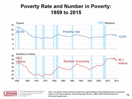
However, according to the latest report by the US Census Bureau, Americans last year (2015) reaped the largest annual gain in nearly a generation as poverty fell, health insurance coverage spread and incomes rose sharply for households on every rung of the economic ladder, ending years of stagnation. The median household’s income in 2015 was $56,500, up 5.2 percent from the previous year — the largest single-year increase since record-keeping began in 1967. The share of Americans living in poverty also posted the sharpest decline in decades. The average incomes of the poorest fifth of the population increased 6.6 percent after three consecutive years of decline. And the official poverty rate declined to 13.5 percent from 14.8 percent in 2014, the sharpest decline since the late 1960s.
But beneath these headline figures, the story is not so sanguine. The numbers still offer a lopsided picture, with a gargantuan share of income rising to the top. While the bottom fifth of households increased their share of the nation’s income, by the census’s definition, to 3.4 percent from 3.3 percent, the richest 5 percent kept 21.8 percent of the pie, the same as in 2014.
And incomes in the middle, measured in 2015 dollars, were still 1.6 percent below the previous peak of $57,423 a household, which was attained in 2007, just before the economy sank into what has come to be known as the Great Recession. Today, US median household incomes are still 2.4 percent below the absolute peak they hit in 1999 just before the dot.com bust and global financial crash.

Indeed, according to Elise Gould of the Economic Policy Institute, the income of American households in the middle of the distribution last year was still 4.6 percent below its level in 2007 and 5.4 percent below where it was in 1999. Men’s earnings from work increased 1.5 percent. But they are still lower than in the 1970s!
Households at the 10th percentile — those poorer than 90 percent of the population — are still a bit poorer than they were in 1989. Across the entire bottom 60 percent of the distribution, households are taking home a smaller slice of the pie than they did in the 1960s and 1970s. The 3.4 percent of income that households in the bottom fifth took home last year was less than the 5.8 percent they had in 1974. By contrast, households in the top 5 percent have profited nicely from America’s expansions. In 2015, they took in $350,870, on average. That is 4.9 percent more than in 1999 and 37.5 percent more than in 1989!
Sure in 2015, the US poverty rate dropped by 1.2%. However, there are still 43.1 million people living in poverty in the US, up from 38 million in 2007. The poverty rate has hardly budged since the 1980s.
So let’s sum up; what does all the analysis of global and national inequality tell us?
First, that global inequality has increased since the early 1980s, when ‘globalisation’ got moving. Second, that global growth of incomes has been concentrated in China, and to a lesser extent and more recently, India. Otherwise average global household income growth would have been much lower. Third, there has been a rise in average household incomes in the major advanced capitalist economies since the 1980s, but the growth has been much less than in China or India (starting from way further down the income levels) and much less than the top 1-5% have gained. Fourth, since the beginning of the millennium, most households in the top capitalist economies have seen their incomes from work or interest on savings stagnate and must rely on transfers and benefits to improve their lot.
These outcomes are down partly to globalisation by multinational capital taking factories and jobs into what used to be called the Third World; and partly due to neo-liberal policies in the advanced economies (i.e. reducing trade union power and labour rights; casualization of labour and holding down wages; privatisation and a reduction in public services, pensions and social benefits). And it is also down to regular and recurrent collapses or slumps in capitalist production, which lead to a loss of household incomes for the majority that can never be restored in any ‘recovery’, particularly since 2009.
In other words, rising inequality is the result the drive of capital to reduce labour’s share and raise profits and to the recurrent and periodic failures of capitalist production. That is something that the likes of FT and mainstream economics wishes to ignore.
For more on inequality: see my booklet:
https://www.amazon.com/Essay-Inequality-issue…/…/ref=sr_1_5…
No comments:
Post a Comment